Writing Articles
Villainous Villanelle: Day 22 of National Poetry Month
Unruly: Day 21 of National Poetry Month
Down the rabbit hole in search of the origins of a few old expressions and an unruly poem presents itself.

Tenacious: Day 20 of National Poetry Month
In honor of Vinitha Dileep’s 300th week of Fiction Mondays! Congratulations for her persistent, tenacious, resolve.

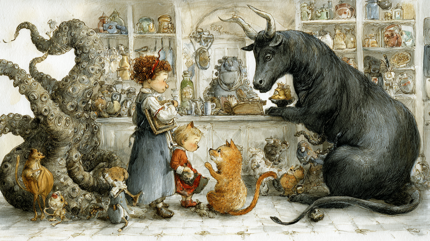
Secrets of the Terrarium: Day 19 of National Poetry Month
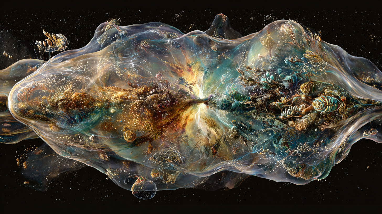
Renewal: Day 18 of National Poetry Month

Quintessential, Querulous Quintet: Day 16/17 of National Poetry Month
I could no longer count or recite the alphabet in order. Last time that happened was in college, when I briefly worked in the Library – after hours of shelving books by Library of Congress numbers…

Pixellated People: Day 15 of National Poetry Month
Does technology bridge the divide between us? Does it inspire creativity or resist it? You be the judge.

Ode to Imagination: Day 14 of National Poetry Month
Perhaps conflict is a universal theme, not ony between humans but between the natural forces of the planet itself.